

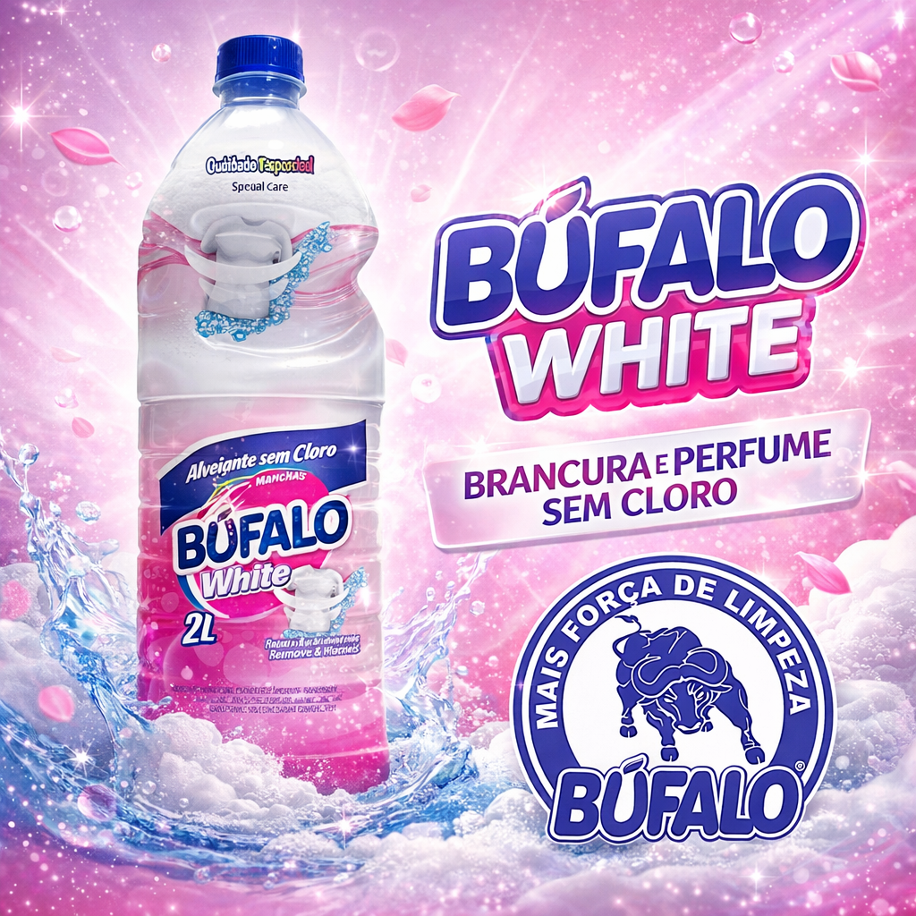



How to create social media images that strengthen a brand
Professional images help audiences recognize a company and quickly understand its message. However, a consistent profile does not depend on aesthetics alone. Each piece needs a purpose, a clear hierarchy, and content suited to the channel.
Posts can educate, demonstrate, answer questions, show behind-the-scenes content, and promote offers. When all creative assets are promotional, audiences find few reasons to follow. A balanced content calendar delivers value before and after the sale.
Visual identity and consistency
Colors, fonts, shapes, photographs, and illustrations should create a recognizable visual language. Consistency does not mean repeating the same template. Compositions can vary while maintaining elements that connect each publication to the brand.
A simple style guide helps the team maintain sizes, color palette, margins, and logo usage. This reduces improvisation and streamlines campaign production.
Single post or carousel?
Single posts work well for direct messages, dates, and high-impact images. Carousels allow a topic to be broken into steps, comparisons, or lists. The first slide presents a clear promise; the following slides develop the idea; and the last one suggests a coherent call to action.
There is no need to fill ten slides when the content fits in five. Every screen must add information. Short text, contrast, and white space make reading more comfortable on mobile.
Visual content for LinkedIn, Instagram, and other channels
The same content plan can be adapted, but audience behavior differs. On LinkedIn, professional context and key takeaways tend to stand out. On Instagram, visual demonstrations, behind-the-scenes content, and educational carousels tend to perform well. Adaptation should consider format and intent, not just resizing the artwork.
Images generated with artificial intelligence
AI expands creative possibilities, but requires direction and curation. Hands, text, objects, and brand details must be reviewed. It is also necessary to avoid misleading images and to observe rights, authorizations, and platform policies.
The tool works best when there is a concept, reference, and visual standard in place. The final choice remains a communication decision.
Accessibility and readability
Small fonts and low contrast hinder access. The main text must be legible on a mobile screen. Essential information should not rely solely on color. Alternative descriptions can assist people who use screen readers.
How to measure results?
Reach shows distribution; saves and shares indicate usefulness; profile visits, clicks, and messages reveal interest. Analysis should compare similar content and consider the objective of each publication.
Frequently asked questions
Is it necessary to post every day? No. Frequency should be sustainable. Regularity and quality matter more than filling the calendar.
How many slides should a carousel have? Only as many as needed to develop the idea clearly.
Does the logo need to appear in everything? The brand should be recognizable, but the logo does not need to dominate every piece.
Design that delivers content
Good creative work guides the eye and aids comprehension. When identity, content strategy, and format are planned together, images stop merely decorating a profile and begin building recognition, relationships, and trust.
How to create content pillars
Pillars are groups of topics that connect brand expertise and audience interest. A company might work with education, demonstration, behind-the-scenes, FAQs, and customer stories, for example. They help maintain variety without losing focus.
Each pillar needs a function. Educational content clarifies; demonstration makes the offer tangible; behind-the-scenes shows the process; social proof reduces uncertainty. The balance shifts according to the company's objective and stage.
A pillar is not a closed list. Questions received, results, and market changes feed new content ideas. The team should record ideas continuously, avoiding reliance on day-of-publication inspiration.
Visual hierarchy on small screens
The eye needs to identify the main message first. Headline, image, supporting text, and signature occupy different levels. When everything carries the same visual weight, reading becomes confusing.
Before approving, preview the artwork at approximately the size it will appear on a mobile screen. Text that looks comfortable on a monitor can become illegible. Margins also protect content from being cropped and from interference by platform interface elements.
How to write for a creative asset
Visual text does not need to repeat the entire caption. It presents the essential idea, while the caption provides context, examples, and sources. Copy should be reviewed to eliminate redundancy and preserve meaning.
Line breaks affect readability. Splitting terms that belong to the same expression can produce awkward interpretations. Typography must respect the language's accents and special characters.
Step-by-step educational carousel
The cover identifies the topic and benefit without promising more than the content delivers. The following slides organize the explanation in sequence. Comparisons can use columns; processes, steps; lists, visual groupings.
A slide should not require the viewer to scroll back several screens to understand terms. Repeating brief context can improve flow without duplicating content. The final slide can summarize and suggest a related action: saving the post, sharing an experience in the comments, or accessing supplementary material.
Photographs, illustrations, and icons
Real photographs help show people, products, and environments. Illustrations allow concepts to be represented and help build visual identity. Icons work as supporting elements, but symbols can carry different meanings; labels prevent ambiguity.
Stock images require an appropriate license. Generic photographs should not be presented as the team or clients. When an image is illustrative, the surrounding context must remain honest.
Consistency without monotony
A visual system can define grids, cover styles, color palette, and photographic treatment. Within it, composition varies according to the content. This allows for recognition without turning a profile into a sequence of copies.
Special campaigns can introduce their own elements while maintaining a connection to the brand. Organized files and approved templates reduce versioning errors.
Content for different audiences
Business communication may address buyers, users, and professionals simultaneously, but each piece should know who it prioritizes. Mixing technical and introductory language in every creative asset alienates both groups.
Labeled series help audiences recognize the level or topic. The caption can offer paths to deeper content without overloading the image.
Social proof and responsibility
Testimonials, figures, and results must be truthful, verifiable, and authorized. An individual result should not be presented as a guarantee. Screenshots of conversations may expose personal data and require care.
Before-and-after content only makes sense when conditions are comparable and the presentation is not misleading. In regulated industries, the company must verify specific rules before publishing.
Artificial intelligence and brand coherence
Prompts can describe composition, lighting, and style, but the final image must be evaluated. Impossible objects, distorted text, altered logos, and stereotypes are common risks. Generated people should not be presented as real clients.
A library of references, instructions, and review criteria improves consistency. Even so, campaign decisions and responsibility remain human.
Accessibility beyond contrast
Alternative text can describe visual information not repeated in the caption. Videos and animations should account for subtitles and motion. Color should not be the only way to distinguish categories.
Plain language, direct sentences, and clear organization are also accessibility features. A simple piece does not need to be superficial; it needs to reduce unnecessary barriers.
Production and approval workflow
A brief should include objective, audience, message, format, deadline, and materials. The review process can separate content, copyediting, design, and legal requirements. Having many people editing directly without a final decision-maker increases inconsistency.
Versions need clear names and an official storage location. After approval, formats are exported and verified. Scheduling should confirm caption, link, tags, and cover image.
How to analyze what worked
Compare pieces with the same objective. A relationship post should not be judged solely by immediate sales. Saves may indicate usefulness; shares, identification; clicks, interest in going deeper.
Context affects results: topic, distribution, timing, campaign, and profile size. Avoid drawing conclusions from a single publication. Patterns emerge from series and longer periods.
Checklist for a visual content package
Define channels, frequency, pillars, formats, and objectives. Gather identity assets, logo files, photographs, and references. Provide information on products, dates, restrictions, and approval stakeholders.
Agree on what will be delivered: content plan, copy, captions, design, resizing, and publishing. Clarify revision rounds, information sources, licenses, and access to editable files.
A feed that reflects the real delivery
Visual presence creates expectations about organization and quality. It must correspond to the experience the client will actually encounter. When content is honest, legible, and recognizable, aesthetics cease to be a superficial layer and begin supporting a consistent relationship with the audience.
Before publishing, do a final review on a mobile device and read the artwork and caption as a unit. Check dates, prices, names, links, and calls to action. If the publication cites external information, record the source used during production. This editorial care prevents speed and frequency from undermining the credibility built through design.